step
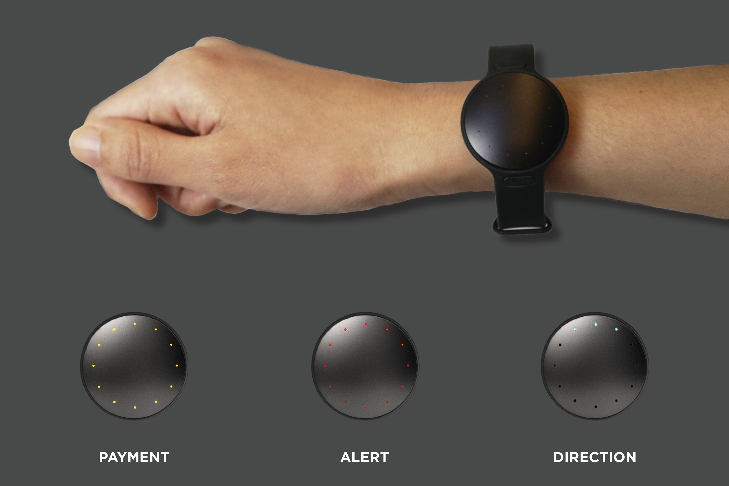
Step is an organization that collaborates with the music festivals industry in the United States. Step provides a safety system at a music festival to keep its audiences safe and to let them enjoy the music and its atmosphere. For this project, I developed creating the organization and designed the wristband, icons, way-finding system, maps, and stations for the festivals all by myself.
The main goal of this project was to design a venue that provides easy and safe access for the audiences. I started the design with creating stations that can be recognized from far and even at night in the dark. Then, I made a map and icons based on the sizes and the shapes of the stations.
I chose circle as an identity of the brand since it represents the beauty of music festivals: Unites people as one.
STEPはアメリカの音楽フェスティバル業界とコラボレーションし、「より安全で楽しいフェスティバル」を実現させる団体です。卒業制作としてこの団体の発案、構成、デザインを全て一人で行いました。
この団体最大の目的は、会場内で参加者が安全に、迷うことなく行きたいところへ移動し、純粋にフェステバルを楽しめるようにすること。そこでまず、会場内のどこにいても、夜間でも、しっかりと認識出来てたどり着けるトイレ、ウォーターステーション、ナースステーションのデザインからスタートしました。それらのステーションデザインを元に、マップ、アイコン、サインエイジを制作しました。
ブランドアイデンティティーに丸・球を選ぶことで、音楽フェスティバルの美でもある”結束・共鳴”を表現しました。